


TL;DR:
Test management reports fall into two categories: informative (showing current status) and analytic (revealing trends and root causes). To make confident release decisions, focus on coverage heat maps to spot quality gaps, track test execution progress by release and priority, analyze defect patterns by root cause and environment, and establish consistent project structures so reports can scale across your enterprise. The goal isn't perfect data—it's actionable insight when you need to decide whether to ship or hold.
The Two Types of Reports That Matter
When you're staring at a dashboard trying to decide if your release is ready, you need to know what kind of question you're asking. Are you checking current status, or are you diagnosing a problem?
Informative reports give you the overview. They show raw data: how many test runs passed, how many defects are open, what your execution progress looks like by day. These reports require minimal configuration. Filter by release or test cycle, and you'll see where things stand. They're useful for quick checks and stakeholder updates, but they won't tell you why something's failing or where the risk is concentrated.
Analytic reports go deeper. They reveal trends, patterns, and relationships between test objects. They answer questions like: Which requirements have the worst quality? Where are defects clustering? What's causing failures—environment issues, code quality, or test design problems? These reports require more setup. You need proper linking between requirements and test cases, consistent use of tracking fields, and a structured approach to test execution. But when you need to make a release decision under pressure, analytic reports are what give you confidence.
The key is knowing which type you need. For a daily standup, informative is fine. For a go/no-go decision, you need analytic.
Reading Heat Maps: Where Quality Lives and Dies
The most powerful analytic view in test management is the coverage heat map—specifically, the requirement-to-test-run coverage report. Each cell represents one requirement. The size of the cell shows how many test runs are linked to that requirement. The color shows quality.
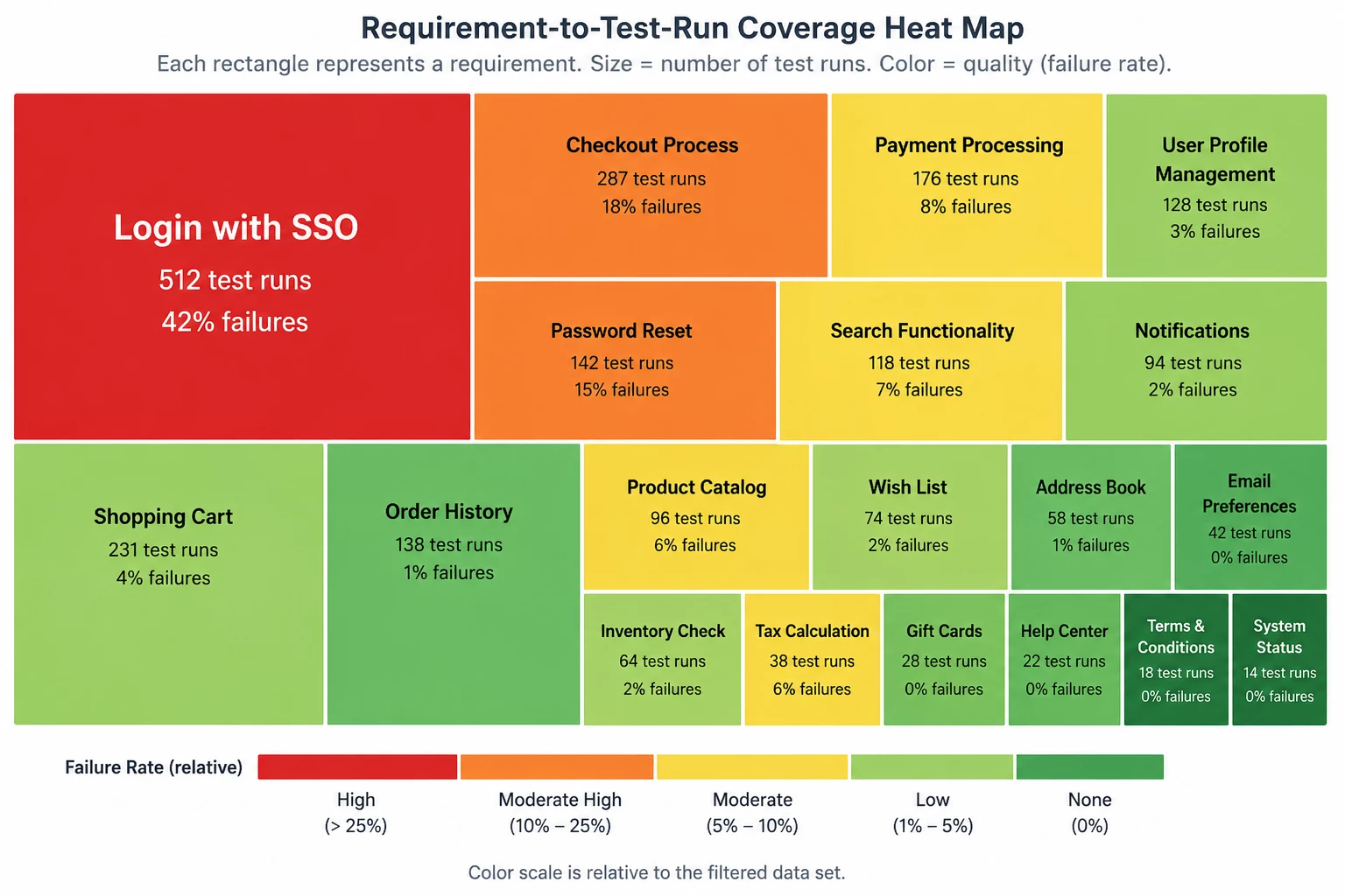
Here's how to interpret it:
Cell size = importance. A large cell means many test runs are linked to that requirement. That's either a complex feature or a critical one. Either way, it matters.
Cell color = quality. The color scale runs from red (high failure rate) to dark green (no failures). But here's the critical detail: the color scale is relative, not absolute. Eight failed test runs might show as red in one heat map and yellow in another, depending on the overall failure distribution in your filtered data set. The system adjusts the scale based on what you're looking at.
What you're looking for: Big red cells. If your largest, most important requirement is showing red, you have a critical quality issue. That's a hold-the-release signal. If you see scattered yellow or orange in smaller cells, you can assess whether those are low-priority test cases you can defer to the next release.
The ideal heat map is all dark green. You won't always get there. But if you're seeing red in your biggest features, you're not ready to ship.
One more thing: if you don't use formal requirements in your test management structure, you can generate a similar heat map using test design modules as feature components. The principle is the same—visualize coverage and quality by functional area.
Tracking Test Execution: Progress Isn't the Same as Readiness
Most teams track test execution progress by counting how many tests have run. That's useful, but it's not enough. You need to track results by the dimensions that matter for your release decision.
Group by release. If you're managing multiple releases simultaneously, filter your execution reports by release so you're not mixing data. You want to see the pass/fail distribution for this release, not an aggregate of everything in flight.
Layer in priority. Combine test execution status with test run priority. A release with 85% pass rate sounds marginal—until you realize all the failures are low-priority edge cases and your critical path is 100% green. Conversely, a 95% pass rate means nothing if the 5% that's failing includes your authentication flow.
Show it as percentages, not raw counts. When you're looking at 2,000 test runs, it's hard to assess readiness from absolute numbers. Convert to percentages. If your release criteria is 90% pass rate for critical tests, you need to see that number clearly. Most test management platforms let you build formulas to calculate pass rate as a percentage of total runs within your filtered data set.
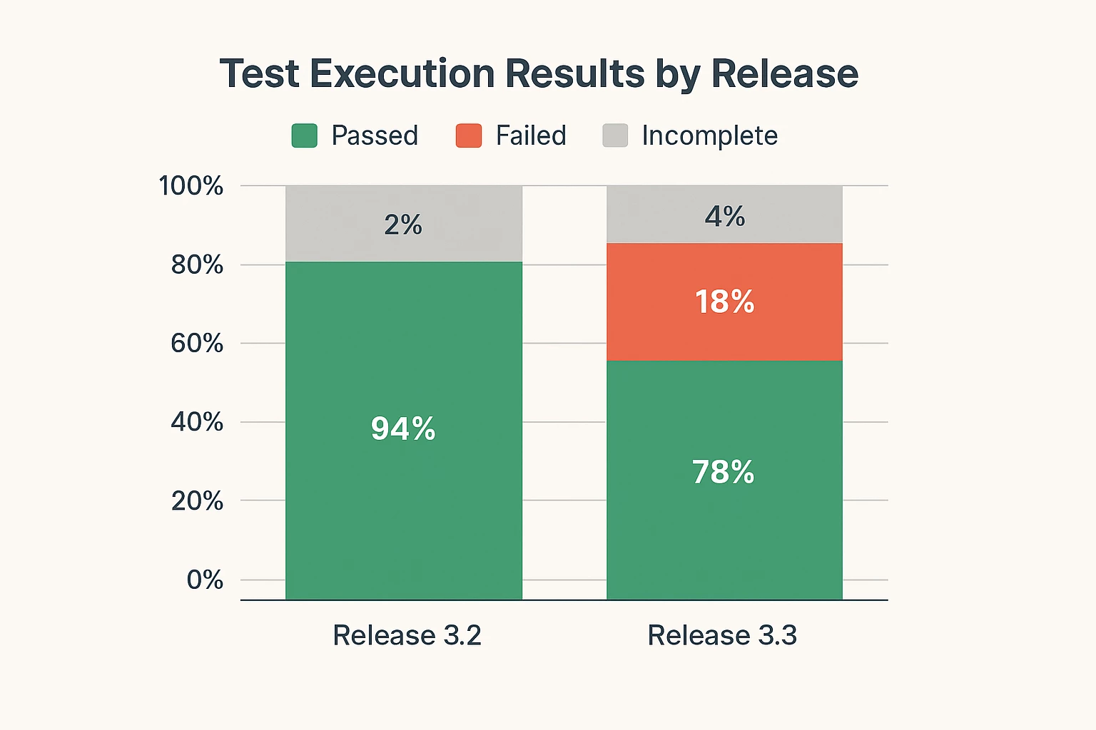
The goal is a quick visual answer to the question: "Can we ship this?" If you're above your threshold and your failures are in acceptable areas, you're ready. If not, you know exactly what needs attention.
Defect Analysis: Finding the Pattern Behind the Failures
Defect counts tell you there's a problem. Defect analysis tells you what kind of problem and where to fix it.
Track by root cause. When you log defects, capture root cause: was it a code quality issue, an environment configuration problem, a gap in test design, or a requirements misunderstanding? When you aggregate defects by root cause, you can see systemic issues. If 60% of your defects trace back to environment setup, you don't have a code problem—you have an infrastructure problem.
Track by testing phase and severity. Defects found in UAT are more expensive than defects found in SIT. High-severity defects in late-stage testing are red flags. Build reports that show defect distribution by phase and severity so you can spot patterns: Are you catching critical issues early, or are they slipping through to the end?
Track by feature component or workstream. If your test design is organized by feature area, you can auto-populate the module field when defects are submitted from test cases. That lets you generate defect distribution reports by feature component. You'll see which parts of your application are fragile and which are stable. That's essential for risk assessment during release planning.
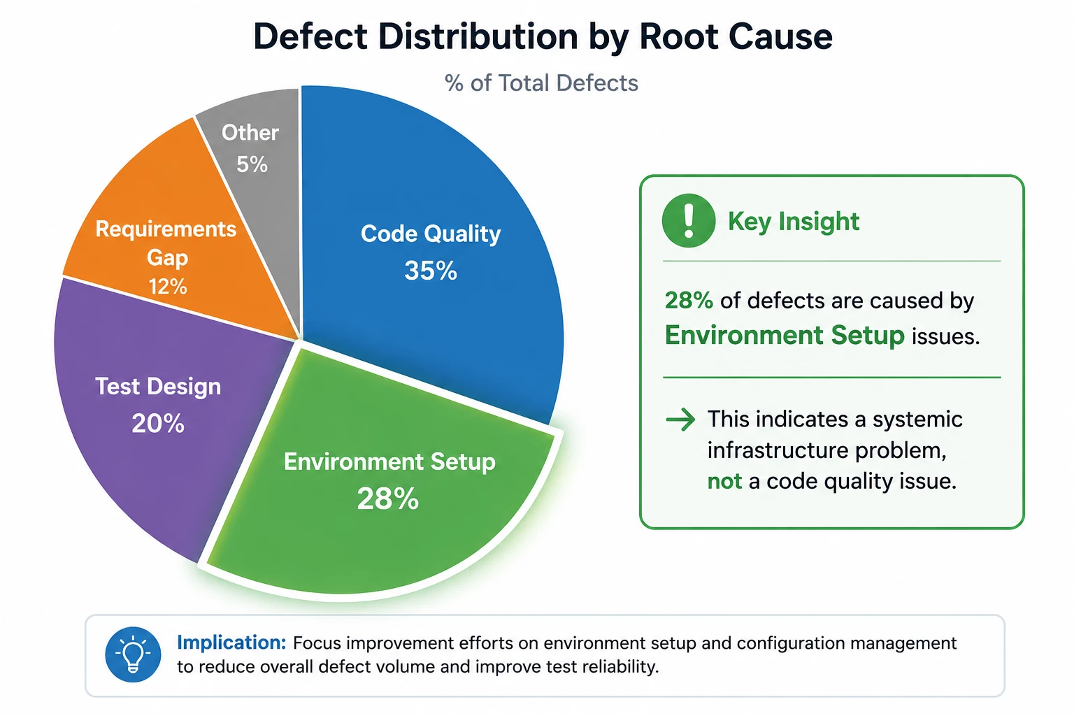
The point isn't to assign blame. It's to identify where improvement efforts will have the most impact. If defects cluster in one area, that's where you focus.
Scaling Reports Across Enterprise Projects
If you're managing 200 projects, you can't build custom reports for each one. You need templates.
Here's the approach: Build a report once with the right structure, formulas, and visualizations. Save it as a shared template. When a new project starts, open the template, replace the global filter with the new project's data (release, test cycle, module), and save it with a new name. You've just cloned a complete reporting structure in minutes.
But this only works if your projects follow consistent patterns. If one project structures test execution by release → testing type → environment → test suite, and another uses a completely different hierarchy, your template won't map correctly. The fields you're filtering on won't align.
The key to scalability is standardization. Define a common structure for test design (how many module levels, what they represent) and test execution (release, cycle, suite hierarchy). Define standard properties for test runs (priority, automation type) and defects (root cause, severity, affected environment). When every project uses the same structure, your report templates become reusable assets.
This isn't about rigid process for its own sake. It's about making quality intelligence portable. When a new project spins up, you want your team to have working dashboards on day one, not three weeks later after someone manually rebuilds everything.
Dashboards vs. Scheduled Reports: When to Use Each
Dashboards are for high-level visibility. They combine multiple metrics into a single view: test execution status, defect trends, coverage summaries. They're what you share with stakeholders and display in team spaces. But dashboards show aggregated data. You see the summary, not the details.
Scheduled reports are for detailed tracking. They include the underlying data tables—lists of requirements, test cases, defect IDs, execution results. You can see exactly which test case failed, which requirement it's linked to, and what priority it has. That's what you need for operational work: triaging failures, assigning fixes, tracking resolution.
Use dashboards for overview and alignment. Use scheduled reports for execution and troubleshooting. And make sure your global filters are set correctly for both, or you'll be looking at the wrong data.
The Real Goal: Confidence, Not Perfection
You'll never have perfect test coverage. You'll never eliminate all defects. The goal of test management reporting isn't perfection—it's confidence.
Can you look at your heat map and know which features are solid and which are risky? Can you look at your execution progress and know whether you've tested the critical paths? Can you look at your defect analysis and know whether the failures you're seeing are acceptable for this release, or whether they represent systemic problems that need resolution before you ship?
If you can answer those questions clearly, your reporting is working. If you can't, you need better structure, better filters, or better metrics. Because when someone asks, "Are we ready to release?" the answer shouldn't be a guess. It should be a decision backed by evidence.
And that's what quality intelligence is for.
Want to see these concepts in action?
Watch the full expert session where Anna Trinh Vu walks through live examples of building and interpreting these reports in Tricentis qTest: Tricentis expert session: Analyzing test results and improving release decisions with Tricentis qTest Insights